Waze EDA Python Project Report
Waze EDA Project Report
Google Advanced Data Analytics Course (Python EDA)
Introduction
As part of the ongoing effort at Waze to better understand user churn, this report outlines the Exploratory Data Analysis - including the Data Cleaning performed, Data Visualizations, and Evaluation & Results.
Exploratory data analysis
The purpose of this project is to conduct exploratory data analysis (EDA) on a provided dataset.
The goal is to continue the examination of the data, adding relevant visualizations that help communicate the story that the data tells.
This report includes 4 parts:
Part 1: Imports, links, and loading
Part 2: Data Exploration & Data cleaning
Part 3: Building visualizations
Part 4: Evaluating and sharing results
Visualize a story in Python
Part 1. Imports and data loading
For EDA of the data, the following code was used to import the necessary libraries:
# Import libraries
import pandas as pd
import numpy as np
import matplotlib.pyplot as plt
import seaborn as sns
import datetime as dt
Read in the data and store it as a dataframe object called df.
# Load the dataset into a dataframe
df = pd.read_csv('waze_dataset.csv')
- The data is in a useable format and does not need to be restructured.
- The labels variable is missing 700 values.
Task 2. Data exploration and cleaning
- The most applicable data columns are label, sessions, drives, n_days_after_onboarding, driven_km_drives,duration_minutes_drives, activity_days, driving_days, and maybe device.
- The total_navigations_fav1/2 propbably aren’t very useful for right now.
- Using df.info() can indicate missing or null values. The missing data can either be removed, ignored, or filled in with estimates or calculated values.
- Using statistical analysis, outliers can be identified and determine if they are anomalies, errors, or something worth exploring further.
Data overview and summary statistics
df.head()
| ID | label | sessions | drives | total_sessions | n_days_after_onboarding | total_navigations_fav1 | total_navigations_fav2 | driven_km_drives | duration_minutes_drives | activity_days | driving_days | device |
|---|---|---|---|---|---|---|---|---|---|---|---|---|
| 0 | retained | 283 | 226 | 296.748273 | 2276 | 208 | 0 | 2628.845068 | 1985.775061 | 28 | 19 | Android |
| 1 | retained | 133 | 107 | 326.896596 | 1225 | 19 | 64 | 13715.920550 | 3160.472914 | 13 | 11 | iPhone |
| 2 | retained | 114 | 95 | 135.522926 | 2651 | 0 | 0 | 3059.148818 | 1610.735904 | 14 | 8 | Android |
| 3 | retained | 49 | 40 | 67.589221 | 15 | 322 | 7 | 913.591123 | 587.196542 | 7 | 3 | iPhone |
| 4 | retained | 84 | 68 | 168.247020 | 1562 | 166 | 5 | 3950.202008 | 1219.555924 | 27 | 18 | Android |
df.size
194987
Generate summary statistics using the describe() method.
df.describe()
| ID | sessions | drives | total_sessions | n_days_after_onboarding | total_navigations_fav1 | total_navigations_fav2 | driven_km_drives | duration_minutes_drives | activity_days | driving_days | |
|---|---|---|---|---|---|---|---|---|---|---|---|
| count | 14999.000000 | 14999.000000 | 14999.000000 | 14999.000000 | 14999.000000 | 14999.000000 | 14999.000000 | 14999.000000 | 14999.000000 | 14999.000000 | 14999.000000 |
| mean | 7499.000000 | 80.633776 | 67.281152 | 189.964447 | 1749.837789 | 121.605974 | 29.672512 | 4039.340921 | 1860.976012 | 15.537102 | 12.179879 |
| std | 4329.982679 | 80.699065 | 65.913872 | 136.405128 | 1008.513876 | 148.121544 | 45.394651 | 2502.149334 | 1446.702288 | 9.004655 | 7.824036 |
| min | 0.000000 | 0.000000 | 0.000000 | 0.220211 | 4.000000 | 0.000000 | 0.000000 | 60.441250 | 18.282082 | 0.000000 | 0.000000 |
| 25% | 3749.500000 | 23.000000 | 20.000000 | 90.661156 | 878.000000 | 9.000000 | 0.000000 | 2212.600607 | 835.996260 | 8.000000 | 5.000000 |
| 50% | 7499.000000 | 56.000000 | 48.000000 | 159.568115 | 1741.000000 | 71.000000 | 9.000000 | 3493.858085 | 1478.249859 | 16.000000 | 12.000000 |
| 75% | 11248.500000 | 112.000000 | 93.000000 | 254.192341 | 2623.500000 | 178.000000 | 43.000000 | 5289.861262 | 2464.362632 | 23.000000 | 19.000000 |
| max | 14998.000000 | 743.000000 | 596.000000 | 1216.154633 | 3500.000000 | 1236.000000 | 415.000000 | 21183.401890 | 15851.727160 | 31.000000 | 30.000000 |
And summary information using the info() method.
df.info()
<class 'pandas.core.frame.DataFrame'>
RangeIndex: 14999 entries, 0 to 14998
Data columns (total 13 columns):
 #   Column                   Non-Null Count  Dtype
---  ------                   --------------  -----
 0   ID                       14999 non-null  int64
 1   label                    14299 non-null  object
 2   sessions                 14999 non-null  int64
 3   drives                   14999 non-null  int64
 4   total_sessions           14999 non-null  float64
 5   n_days_after_onboarding  14999 non-null  int64
 6   total_navigations_fav1   14999 non-null  int64
 7   total_navigations_fav2   14999 non-null  int64
 8   driven_km_drives         14999 non-null  float64
 9   duration_minutes_drives  14999 non-null  float64
 10  activity_days            14999 non-null  int64
 11  driving_days             14999 non-null  int64
 12  device                   14999 non-null  object
dtypes: float64(3), int64(8), object(2)
memory usage: 1.5+ MB
Dealing with outliers:
- Checking Mins, Maxes, mean vs median, box plots, and other visualizations.
- Keep outliers by determining if they actually make sense to include (input error vs anomaly).
Task 3a. Visualizations
Box plots, Histograms, bar charts, maybe heat maps.
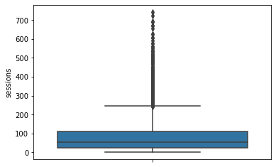
sessions
The number of occurrence of a user opening the app during the month
# Box plot
sns.boxplot(data=df,
           y="sessions")
<matplotlib.axes._subplots.AxesSubplot at 0x7f41f30ac0d0>
# Histogram
sns.histplot(data=df,
            x="sessions",
            binwidth=10)
median = df['sessions'].median()
plt.axvline(median, color='red', linestyle='--')
plt.text(75,1200, 'median=56.0', color='red')
plt.title('sessions histogram plot');
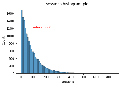
The sessions variable is a right-skewed distribution with half of the observations having 56 or fewer sessions. However, as indicated by the boxplot, some users have more than 700.
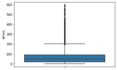
drives
An occurrence of driving at least 1 km during the month
# Box plot
sns.boxplot(data=df,
           y="drives")
<matplotlib.axes._subplots.AxesSubplot at 0x7f41f2a47550>
# Helper function to plot histograms based on the
# format of the `sessions` histogram
def histogrammer(column_str, median_text=True, **kwargs):    # **kwargs = any keyword arguments
                                                             # from the sns.histplot() function
    median=round(df[column_str].median(), 1)
    plt.figure(figsize=(5,3))
    ax = sns.histplot(x=df[column_str], **kwargs)            # Plot the histogram
    plt.axvline(median, color='red', linestyle='--')         # Plot the median line
    if median_text==True:                                    # Add median text unless set to False
        ax.text(0.25, 0.85, f'median={median}', color='red',
            ha='left', va='top', transform=ax.transAxes)
    else:
        print('Median:', median)
    plt.title(f'{column_str} histogram');
# Histogram
histogrammer('drives')
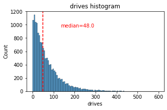
The drives information follows a distribution similar to the sessions variable. It is right-skewed, approximately log-normal, with a median of 48. However, some drivers had over 400 drives in the last month.
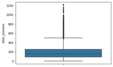
total_sessions
A model estimate of the total number of sessions since a user has onboarded
# Box plot
sns.boxplot(data=df,
           y="total_sessions")
<matplotlib.axes._subplots.AxesSubplot at 0x7f41f2948710>
# Histogram
histogrammer('total_sessions')
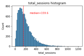
The total_sessions is a right-skewed distribution. The median total number of sessions is 159.6. This is interesting information because, if the median number of sessions in the last month was 48 and the median total sessions was ~160, then it seems that a large proportion of a user’s total drives might have taken place in the last month. This is something you can examine more closely later.
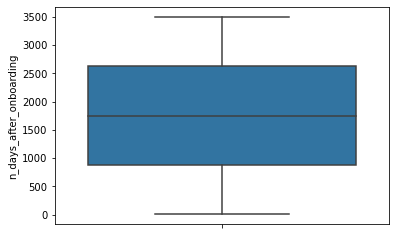
n_days_after_onboarding
The number of days since a user signed up for the app
# Box plot
sns.boxplot(data=df,
           y="n_days_after_onboarding")
<matplotlib.axes._subplots.AxesSubplot at 0x7f41f26404d0>
# Histogram
histogrammer('n_days_after_onboarding',median_text=False)
Median: 1741.0
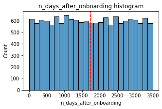
The total user tenure (i.e., number of days since onboarding) is a uniform distribution with values ranging from near-zero to ~3,500 (~9.5 years).
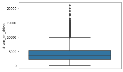
driven_km_drives
Total kilometers driven during the month
# Box plot
sns.boxplot(data=df,
           y="driven_km_drives")
<matplotlib.axes._subplots.AxesSubplot at 0x7f41f2502290>
# Histogram
histogrammer('driven_km_drives')
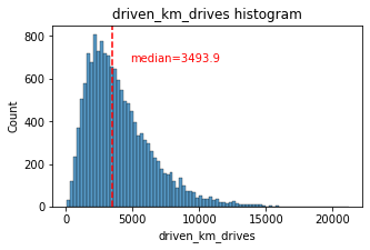
The number of drives driven in the last month per user is a right-skewed distribution with half the users driving under 3,495 kilometers. As you discovered in the analysis from the previous course, the users in this dataset drive a lot. The longest distance driven in the month was over half the circumferene of the earth.
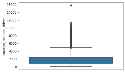
duration_minutes_drives
Total duration driven in minutes during the month
# Box plot
sns.boxplot(data=df,
           y="duration_minutes_drives")
<matplotlib.axes._subplots.AxesSubplot at 0x7f41f26fbbd0>
# Histogram
histogrammer("duration_minutes_drives")
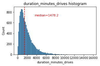
The duration_minutes_drives variable has a heavily skewed right tail. Half of the users drove less than ~1,478 minutes (~25 hours), but some users clocked over 250 hours over the month.
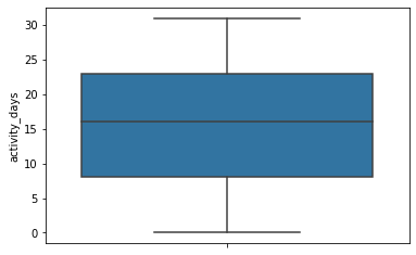
activity_days
Number of days the user opens the app during the month
# Box plot
sns.boxplot(data=df,
           y="activity_days")
<matplotlib.axes._subplots.AxesSubplot at 0x7f41f26d9d90>
# Histogram
histogrammer("activity_days", median_text=False, discrete=True)
Median: 16.0
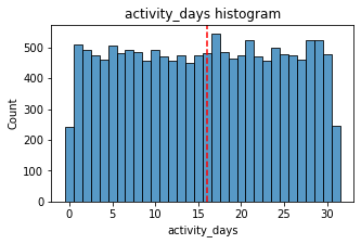
Within the last month, users opened the app a median of 16 times. The box plot reveals a centered distribution. The histogram shows a nearly uniform distribution of ~500 people opening the app on each count of days. However, there are ~250 people who didn’t open the app at all and ~250 people who opened the app every day of the month.
This distribution is noteworthy because it does not mirror the sessions distribution, which you might think would be closely correlated with activity_days.
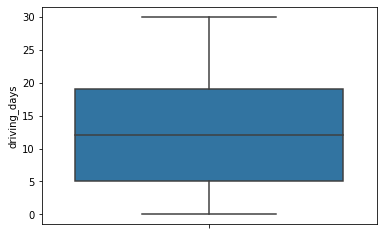
driving_days
Number of days the user drives (at least 1 km) during the month
# Box plot
sns.boxplot(data=df,
           y="driving_days")
<matplotlib.axes._subplots.AxesSubplot at 0x7f41f2751950>
# Histogram
histogrammer('driving_days', median_text=False, discrete=True)
Median: 12.0
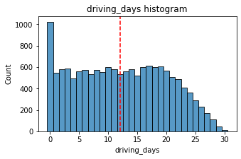
The number of days users drove each month is almost uniform, and it largely correlates with the number of days they opened the app that month, except the driving_days distribution tails off on the right.
However, there were almost twice as many users (~1,000 vs. ~550) who did not drive at all during the month. This might seem counterintuitive when considered together with the information from activity_days. That variable had ~500 users opening the app on each of most of the day counts, but there were only ~250 users who did not open the app at all during the month and ~250 users who opened the app every day. Flag this for further investigation later.
device
The type of device a user starts a session with
# Pie chart
fig, ax = plt.subplots()

df.groupby('device').size().plot(kind='pie',autopct='%1.0f%%',colors=['green','gray'],textprops={'fontsize': 18},)
ax.set_title('% Users by device type',size=18)
ax.set_ylabel('')
plt.show()
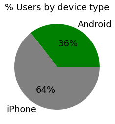
There are nearly twice as many iPhone users as Android users represented in this data.
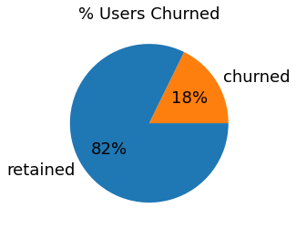
label
Binary target variable (“retained” vs “churned”) for if a user has churned anytime during the course of the month
# Pie chart
fig, ax = plt.subplots()

df.groupby('label').size().plot(kind='pie',autopct='%1.0f%%',colors=['tab:orange','tab:blue'],textprops={'fontsize': 18},)
ax.set_title('% Users Churned',size=18)
ax.set_ylabel('')
plt.show()
Less than 18% of the users churned.
driving_days vs. activity_days
Because both driving_days and activity_days represent counts of days over a month and they’re also closely related, you can plot them together on a single histogram. This will help to better understand how they relate to each other without having to scroll back and forth comparing histograms in two different places.
# Histogram
plt.figure(figsize=(10,6))
sns.histplot([df.driving_days, df.activity_days],
             color=['tab:orange','tab:blue'],
             bins=range(0,33),
             multiple='dodge',
             shrink=.8)
<matplotlib.axes._subplots.AxesSubplot at 0x7f41f29df210>
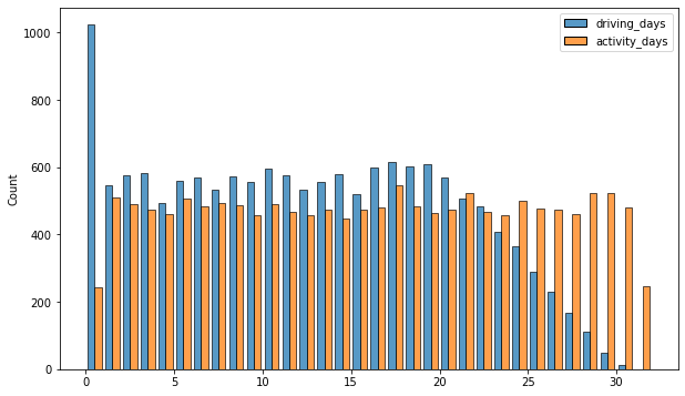
As observed previously, this might seem counterintuitive. After all, why are there fewer people who didn’t use the app at all during the month and more people who didn’t drive at all during the month?
On the other hand, it could just be illustrative of the fact that, while these variables are related to each other, they’re not the same. People probably just open the app more than they use the app to drive—perhaps to check drive times or route information, to update settings, or even just by mistake.
Nonetheless, it might be worthwile to contact the data team at Waze to get more information about this, especially because it seems that the number of days in the month is not the same between variables.
Confirm the maximum number of days for each variable—driving_days and activity_days.
### YOUR CODE HERE ###
print('Max Driving Days: ',df.driving_days.max(),'\nMax Activity Days: ',df.activity_days.max())
Max Driving Days:  30
Max Activity Days:  31
It’s true. Although it’s possible that not a single user drove all 31 days of the month, it’s highly unlikely, considering there are 15,000 people represented in the dataset.
One other way to check the validity of these variables is to plot a simple scatter plot with the x-axis representing one variable and the y-axis representing the other.
# Scatter plot
plt.figure(figsize=(10,6))
sns.scatterplot(data=df,
                x='driving_days',
                y='activity_days')
plt.title('driving_days vs activity_days')
plt.plot([0,31],[0,31],color='red')
[<matplotlib.lines.Line2D at 0x7f41f26c5dd0>]
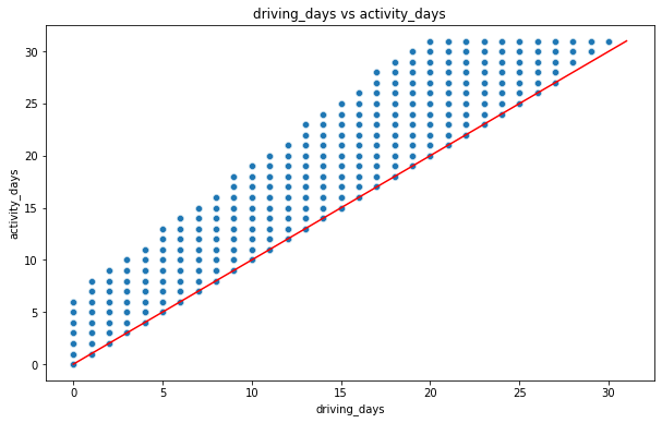
Notice that there is a theoretical limit. If you use the app to drive, then by definition it must count as a day-use as well. In other words, you cannot have more drive-days than activity-days. None of the samples in this data violate this rule, which is good.
Retention by device
# Histogram
plt.figure(figsize=(5,4))
sns.histplot(data=df,
             x='device',
             hue='label',
             multiple='dodge',
            shrink=0.9)
<matplotlib.axes._subplots.AxesSubplot at 0x7f41f27088d0>
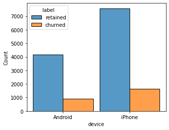
The proportion of churned users to retained users is consistent between device types.
Retention by kilometers driven per driving day
In a previous examination, I discovered that the median distance driven last month for users who churned was 8.33 km, versus 3.36 km for people who did not churn. I want to examine this further.
# 1. Create `km_per_driving_day` column
df['km_per_driving_day'] = (df.driven_km_drives / df.driving_days).round(3)
# 2. Call `describe()` on the new column
df['km_per_driving_day'].describe().round(2)
count    14999.00
mean          inf
std           NaN
min          3.02
25%        167.28
50%        323.15
75%        757.93
max           inf
Name: km_per_driving_day, dtype: float64
The mean value is infinity, the standard deviation is NaN, and the max value is infinity.
This is the result of there being values of zero in the driving_days column. Let’s convert these values from infinity to zero.
# 1. Convert infinite values to zero
df.km_per_driving_day = df.km_per_driving_day.replace(to_replace=np.inf,value=0)
# 2. Confirm that it worked
df.km_per_driving_day.describe().round(2)
count    14999.00
mean       578.96
std       1030.09
min          0.00
25%        136.24
50%        272.89
75%        558.69
max      15420.23
Name: km_per_driving_day, dtype: float64
The maximum value is 15,420 kilometers per drive day. This is physically impossible. Driving 100 km/hour for 12 hours is 1,200 km. It’s unlikely many people averaged more than this each day they drove, so, for now, disregard rows where the distance in this column is greater than 1,200 km.
Below is a histogram of the new km_per_driving_day column, disregarding those users with values greater than 1,200 km.
# Histogram
plt.figure(figsize=(10,6))
sns.histplot(data=df,
             x='km_per_driving_day',
             bins=range(0,1201,20),
             hue='label',
             multiple='fill')
<matplotlib.axes._subplots.AxesSubplot at 0x7f41f5d21d10>
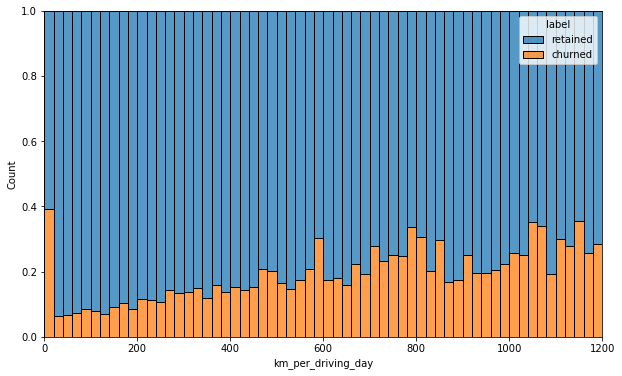
The churn rate tends to increase as the mean daily distance driven increases, confirming what was found in the previous course. It would be worth investigating further the reasons for long-distance users to discontinue using the app.
Churn rate per number of driving days
# Histogram
plt.figure(figsize=(10,6))
sns.histplot(df,
             x='driving_days',
             hue='label',
             multiple='fill',
             discrete=True)
<matplotlib.axes._subplots.AxesSubplot at 0x7f41f2154e10>
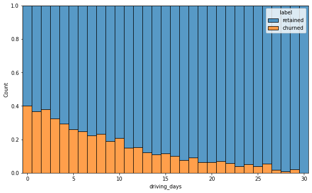
The churn rate is highest for people who didn’t use Waze much during the last month. The more times they used the app, the less likely they were to churn. While 40% of the users who didn’t use the app at all last month churned, nobody who used the app 30 days churned.
This isn’t surprising. If people who used the app a lot churned, it would likely indicate dissatisfaction. When people who don’t use the app churn, it might be the result of dissatisfaction in the past, or it might be indicative of a lesser need for a navigational app. Maybe they moved to a city with good public transportation and don’t need to drive anymore.
Proportion of sessions that occurred in the last month
Let’s create a new column percent_sessions_in_last_month that represents the percentage of each user’s total sessions that were logged in their last month of use.
df['percent_sessions_in_last_month'] = (df.sessions / df.total_sessions * 100).round(2)
What is the median value of the new column?
df.percent_sessions_in_last_month.median()
42.31
Now, let’s see a histogram depicting the distribution of values in this new column.
# Histogram
histogrammer('percent_sessions_in_last_month',
            hue=df['label'],
            multiple='layer',
            median_text=False)
Median: 42.3
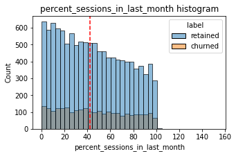
Check the median value of the n_days_after_onboarding variable.
df.n_days_after_onboarding.median()
1741.0
Half of the people in the dataset had 40% or more of their sessions in just the last month, yet the overall median time since onboarding is almost five years.
Here’s a histogram of n_days_after_onboarding for just the people who had 40% or more of their total sessions in the last month.
# Histogram
plt.figure(figsize=(5,3))
sns.histplot(data=df[df['percent_sessions_in_last_month']>=40],
            x='n_days_after_onboarding')
plt.title('N Days after Onboarding\n(only users with 40% or greater session in the last month)')
Text(0.5, 1.0, 'N Days after Onboarding\n(only users with 40% or greater session in the last month)')
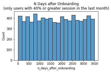
The number of days since onboarding for users with 40% or more of their total sessions occurring in just the last month is a uniform distribution. This is very strange. It’s worth asking Waze why so many long-time users suddenly used the app so much in the last month.
Task 3b. Handling outliers
The box plots from the previous section indicated that many of these variables have outliers. These outliers do not seem to be data entry errors; they are present because of the right-skewed distributions.
Depending on what you’ll be doing with this data, it may be useful to impute outlying data with more reasonable values. One way of performing this imputation is to set a threshold based on a percentile of the distribution.
To employ this technique, below is a function that calculates the 95th percentile of a given column, then imputes values > the 95th percentile with the value at the 95th percentile. such as the 95th percentile of the distribution.
def impute_95(column_name):
    qnt_95 = column_name.quantile(q=.95)
    col_name_95 = column_name.mask(column_name > qnt_95,qnt_95,inplace=False)
    return col_name_95
Next, I will apply that function to the following columns:
- sessions
- drives
- total_sessions
- driven_km_drives
- duration_minutes_drives
col_list = ['sessions','drives','total_sessions','driven_km_drives','duration_minutes_drives']
for col in col_list:
    df[col] = impute_95(df[col])
df.describe()
| ID | sessions | drives | total_sessions | n_days_after_onboarding | total_navigations_fav1 | total_navigations_fav2 | driven_km_drives | duration_minutes_drives | activity_days | driving_days | km_per_driving_day | percent_sessions_in_last_month | |
|---|---|---|---|---|---|---|---|---|---|---|---|---|---|
| count | 14999.000000 | 14999.000000 | 14999.000000 | 14999.000000 | 14999.000000 | 14999.000000 | 14999.000000 | 14999.000000 | 14999.000000 | 14999.000000 | 14999.000000 | 14999.000000 | 14999.000000 |
| mean | 7499.000000 | 76.568705 | 64.058204 | 184.031320 | 1749.837789 | 121.605974 | 29.672512 | 3939.632764 | 1789.647426 | 15.537102 | 12.179879 | 578.963120 | 44.925552 |
| std | 4329.982679 | 67.297958 | 55.306924 | 118.600463 | 1008.513876 | 148.121544 | 45.394651 | 2216.041510 | 1222.705167 | 9.004655 | 7.824036 | 1030.094387 | 28.691861 |
| min | 0.000000 | 0.000000 | 0.000000 | 0.220211 | 4.000000 | 0.000000 | 0.000000 | 60.441250 | 18.282082 | 0.000000 | 0.000000 | 0.000000 | 0.000000 |
| 25% | 3749.500000 | 23.000000 | 20.000000 | 90.661156 | 878.000000 | 9.000000 | 0.000000 | 2212.600607 | 835.996260 | 8.000000 | 5.000000 | 136.239000 | 19.620000 |
| 50% | 7499.000000 | 56.000000 | 48.000000 | 159.568115 | 1741.000000 | 71.000000 | 9.000000 | 3493.858085 | 1478.249859 | 16.000000 | 12.000000 | 272.889000 | 42.310000 |
| 75% | 11248.500000 | 112.000000 | 93.000000 | 254.192341 | 2623.500000 | 178.000000 | 43.000000 | 5289.861262 | 2464.362632 | 23.000000 | 19.000000 | 558.687000 | 68.720000 |
| max | 14998.000000 | 243.000000 | 201.000000 | 454.363204 | 3500.000000 | 1236.000000 | 415.000000 | 8889.794236 | 4668.899349 | 31.000000 | 30.000000 | 15420.234000 | 153.060000 |
Conclusion
Analysis revealed that the overall churn rate is ~18%, and that this rate is consistent between iPhone users and Android users.
Also, EDA has revealed that users who drive very long distances on their driving days are more likely to churn, but users who drive more often are less likely to churn. The reason for this discrepancy is an opportunity for further investigation, and it would be something else to ask the Waze data team about.
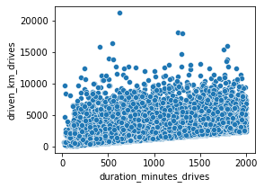
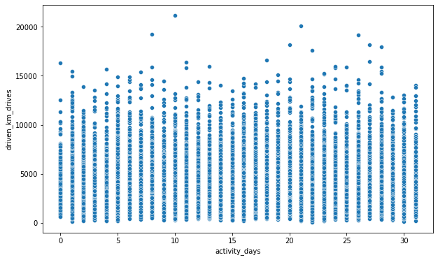
Task 4a. Results and evaluation
I have learned that device type is not a factor in user churn, but that 64% of users are using iPhones.
My other questions are: Why was there so much usage by all users in just the last month? Do the minutes driven and km driven last month make sense on the high end? Are they long haulers testing out the app for a promotion?
Some additional plots I thought of to explore these questions and others are below:
plt.figure(figsize=(4,3))
sns.scatterplot(data=df,
           x=df['duration_minutes_drives'].mask(df['duration_minutes_drives']>2000),
           y=df['driven_km_drives'].mask(df['duration_minutes_drives']>2000))
<matplotlib.axes._subplots.AxesSubplot at 0x7fd7802d1a90>
plt.figure(figsize=(10,6))
sns.scatterplot(data=df,
           x='activity_days',
           y='driven_km_drives')
<matplotlib.axes._subplots.AxesSubplot at 0x7fd780c50d90>
Task 4b. Conclusion
Key Learnings and Obvervations
- Most of the distributions were right tail skewed distributions, but some normal distributions of others. Normal driving habits (drive distance and drive times) are generally in shorter ranges tend to go together.
- The large amount of outliers and scatter plots indicate a major problem with this dataset.
- Much of what I found in this EDA raised more questions than answered.
- 18% of users churned and 82% were retained.
- Fewer driving days correlated with increased user churn. Longer drives also tended to correlate with increased churn.
- This dataset has about an equal representation among all tenure lengths due to the histogram of “n_days_after_onboarding” being a normal distribution.